Qobuz Adds Lyrics in New Update
The best (in my opinion) gets better


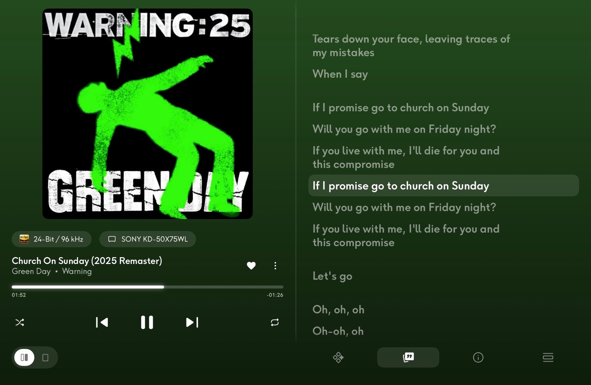
I admit I might be slightly biased when I say this; but the best music streaming service (certainly the most ethical one) just got better. I felt like the big services (Apple Music, Spotify, Deezer, Tidal etc) would keep their advantage in certain areas like live-scrolling lyrics, but here we are. We got it, and it’s so well implemented. I had it written down as one of my wishlist items for Qobuz to introduce, but I wasn’t really that hopeful. The others were a more reliable iOS app, an Apple TV or Google TV app, and Dolby Atmos.
I’m still waiting for the Apple TV app, but I feel like that one was a long-shot because of Apple TV having a limitation on sound quality as far as I’m aware. Perhaps that’ll come with the new hardware. Atmos isn’t really something I feel like I’d use. Especially not yet. But it’d be nice to have at some point. There’s no rush. They’ve delivered on the important stuff. I literally can’t think of anything else I’d change about the service other than the occasional time you get two similarly named bands catalogues getting mixed up. That’s kind of frustrating, but that’s a minor thing that would probably be hard to solve at a platform level. Especially when it’s generally always smaller bands, or more more niche bands from a European perspective, such as from Asia where Qobuz probably aren’t going to be as on the ball in spotting and rectifying these hiccups.
Before I forget, I should mention that this update also refreshes the entire player interface. It’s a huge step up in usability and interface feel. It’s so well polished. The layout is worlds better than the previous version, which just had a history page, the artwork and playback controls, and the queue page to the right.
With this change, you can tell they’ve put a lot of effort into getting it just right. They probably went through numerous iterations to get to the final result. This time, there’s one page for your queue, with an option to pop out your play history in separate small window. This makes sense, because you’re probably going to look at your history less often than what’s coming up next in the queue. Then, you can select from a new discover screen (which recommends other stuff from the same artist, similar artists, from the same label and so on; the lyrics; information and credits for the song, about the release, bios on artists etc; and the queue. If you select any of these, it will go into a side-by-side view with the player. You can select to go full screen on any of the sections; and if you deselect them, the full-screen player will reappear. It’s really thoughtfully designed, looks good, and it’s noticably smoother and snappier as well.
In general, I think the team at Qobuz are punching well above their weight and I’m really proud to be a customer. I recommend it wholeheartedly to anyone who wants an ethical (actually paying artists a reasonable amount), high quality streaming service; that has a good (and clear) AI policy; and that most importantly, isn’t called Spotify.